

atypica.AI uses AI to simulate consumers, compressing market research from weeks to minutes. But that description is misleading—it sounds like we’re showing off technology, like speed itself is the value. That’s not it.
What we actually do is help people understand people. How consumers think, how they feel, how they make decisions in real-life scenarios. AI is the tool, but the output is insight into human nature. This essence determines what our visual language should be.
So the core question of design becomes: how do we visually present a deep understanding of people?
Right now every AI product in the market uses neon colors, 3D renders, and tech-gradient aesthetics to “look AI”. It’s instinctive, and it’s lazy—if you’re building an AI product, it should look futuristic, right? We chose the opposite direction.
The Less AI, the More AI
This isn’t wordplay. It’s the core of our design philosophy.
Because we simulate people, study people, and serve the act of understanding people itself. So the most accurate visual language should return to people themselves—but not in a soft, muted, safe way. It should have power, drama, visual ambition. It should command attention.
When everyone else is showing off with cheap tech aesthetics, we use professional visual language—cinematography, architectural photography, editorial design. This “anti-AI visual language” is actually the most honest expression of an AI product.
The key insight: avoiding AI clichés doesn’t mean being quiet and restrained. It means using sophisticated tools to create impact.
Real Over Synthetic, But With Drama
We study real consumers, not abstract data points. This means photography should prevail over 3D rendering, natural materials over artificial composites, human presence over abstract symbols.
But “real” doesn’t mean documentary realism only. A cinematic portrait with dramatic lighting is still real—the person exists, the light exists, the moment has truth even if it’s staged. What we avoid is the synthetic feel of CGI renders, the plastic quality of stock infographics, the cheap composite of template designs.
Think about the best cinematic photography—intensely stylized, dramatically lit, yet fundamentally about human emotion and presence. That’s real. A floating 3D hologram surrounded by particle effects? That’s synthetic garbage.
Power and Depth
The value of compressing weeks to minutes isn’t the speed—it’s enabling deeper understanding of people. So visuals should have depth and power.
Power means visual impact. Dramatic color contrast. Strong geometric composition. Cinematic lighting that stops the scroll. Architectural scale and monumentality. We’re competing on social media where attention is measured in fractions of a second. Subtle and muted doesn’t cut it.
Depth means substance that rewards closer looking. Texture you can feel. Composition with tension and breathing room. Color relationships that create mood and meaning. Details that hold up under examination.
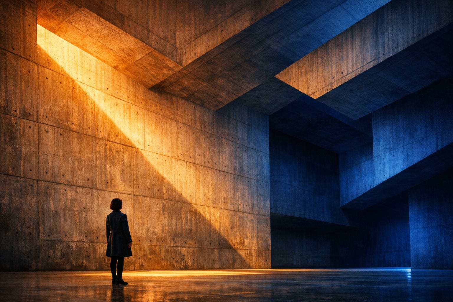
But power and depth together don’t mean complexity. Sometimes the most powerful image is also the simplest—a single figure in vast architectural space, two colors in dramatic contrast, one beam of light cutting through shadow.
Professional But Not Distant
Our clients are decision-makers who need consulting-grade professionalism. But our research subjects are real people who need anthropological empathy. These two things don’t conflict—they demand visual language that’s both authoritative and human.
Imagine top consultancy rigor shot by world-class photojournalists. Academic precision lit like a movie scene. Consultancy authority with editorial magazine aesthetics. This combination is difficult but necessary—it’s exactly the tone atypica.AI should have.
Professional doesn’t mean sterile corporate templates. Human doesn’t mean soft and fuzzy. We can be both powerful and empathetic, both dramatic and honest.
Color as Drama, Not Decoration
Here’s where many design guidelines get it wrong: they say “muted colors” and people hear “avoid color”. That’s not it.
What we avoid is meaningless colorful accents—adding blue and orange to an infographic “to make it pop”. Random rainbow gradients. Neon highlights with no purpose. Color as decoration.
What we embrace is color as drama. Warm amber light against cool cobalt shadows. Deep cinematic color contrast that creates mood and separation. Bold saturation that serves a purpose—whether that’s stopping the scroll on social media or creating emotional atmosphere.
Think about color in film: science fiction’s amber and teal contrasts, contemporary romance’s warm peachy tones, art films’ precise pastels. These use color boldly but with sophistication. The saturation is intentional, controlled, meaningful.
For social media covers, we need colors that demand attention. Deep blues, rich ambers, dramatic contrasts. But achieved through lighting, through environmental color, through photographic reality—not through gradients and graphic overlays.
For reports, we can be more restrained—black, white, gray, perhaps a single accent color. But even there, when color appears, it should have purpose and power.
Visual Language Spectrum
Different content needs different approaches, but all choices return to one question: does this convey the essence honestly and powerfully?
Cinematic Photography: For consumer insights, brand stories, social media impact. Dramatic lighting, strong color contrast, human presence in environmental context. References work by world-class cinematographers and contemporary visual artists. This is our primary language for emotional and human-centered content.
Architectural Photography: For strategic analysis, structural thinking, data-driven insights. Geometric composition, light and shadow drama, monumental scale with human presence for grounding. References work by master architectural photographers. When we need to convey systematic thinking and professional authority.
Documentary Photography: For authentic consumer moments, field research, human stories. Natural light, real environments, honest moments. References work by leading photojournalism institutions and anthropological field photography traditions. When authenticity and realism matter most.
Editorial Design: For reports, presentations, professional documents. Sophisticated typography, restrained color, careful composition. References modernist design classics and European minimalist traditions. When we need consultancy-level precision.
The key is choosing the right tool for each job while maintaining visual coherence across all touchpoints.
Concrete Execution Guidelines
Composition Principles
Rule of thirds is a starting point, not an endpoint: Place main elements at the one-third mark, but have a reason to break this rule. Off-center creates tension, but ensure the frame stays balanced.
Whitespace Allocation:
Social media covers: Leave at least 10-15% safety margins
Report interior pages: Margins should occupy at least 12-15% of the page
Around individual elements: Maintain breathing room equal to at least 30% of the element’s own width
Figure Position and Scale (when people appear):
Architectural/environmental scenes: Figures occupy 1/4 to 1/3 of frame height, not less than 1/5
Medium shots: Figures occupy 1/2 to 2/3 of frame height
Avoid: Figures too small becoming decorative (unless the theme specifically requires conveying smallness)
Eye Direction:
Figure’s gaze should point toward negative space, creating narrative space
Geometric lines should converge or guide eyes to key areas
Light direction should reinforce compositional momentum
Color Usage Details
Primary Color Schemes:
Monochrome + accent: 70% neutrals (black/white/gray) + 30% single color (deep blue, amber, deep green, etc.)
Contrast pairing: 50% warm tones + 50% cool tones, spatially separated (e.g., warm foreground, cool background)
Three-color: 60% primary + 30% secondary + 10% accent
Specific Color Parameters (as reference):
Deep cobalt blue: Hue 200-220°, Saturation 60-80%, Lightness 30-50%
Amber orange: Hue 30-45°, Saturation 70-90%, Lightness 50-70%
Cool blue-gray: Hue 200-220°, Saturation 15-25%, Lightness 40-60%
Warm beige: Hue 35-45°, Saturation 20-35%, Lightness 75-85%
Forbidden Color Combinations:
Neon pink (Saturation >90% + Lightness >80%) + Neon cyan
Rainbow gradients (gradients with more than 3 saturated colors)
No-contrast similar colors (Hue difference <30° with similar saturation and lightness)
Light and Shadow Treatment
Light Source Setup:
Single key light: Create clear light-dark relationship, shadows occupy 30-50% of frame
Ambient + key light: Key creates directionality, ambient fills shadows without eliminating contrast
Avoid: Directionless uniform lighting
Light Angles:
Side light (45-60 degrees): Best reveals texture and dimensionality
Top light (70-90 degrees): Creates drama and geometric quality
Backlight: For silhouettes and outlines, suitable for conceptual content
Light-Dark Contrast:
High contrast: Brightness difference between lightest and darkest areas >60%, for dramatic scenes
Medium contrast: Brightness difference 40-60%, for most content
Low contrast: Brightness difference <40%, only for specific emotional expression
Image Technical Specifications
Output Dimensions:
Social media covers (16:9): 1920x1080px minimum, 2560x1440px recommended
Square (1:1): 1080x1080px minimum, 2000x2000px recommended
Report illustrations: 300 DPI, minimum edge 2000px
Website hero images: 3840x2160px (4K) for key positions
File Formats:
Photography: JPEG (quality 90-95%) or WebP
Transparency needed: PNG
Print use: TIFF or high-quality PDF
Compression Standards:
Social media: File size <500KB, but don’t sacrifice visible quality
Website use: <1MB, key images can go to 2MB
Print: No compression, maintain original quality
Decision Flow
Step 1: Determine Content Type
Consumer insights/brand stories → Cinematic photography language
Strategic analysis/data reports → Architectural photography language
Real stories/case studies → Documentary photography language
Professional documents/presentations → Editorial design language
Step 2: Choose Color Strategy
Need strong impact (social media) → High saturation contrast pairing
Need professional authority (reports) → Black/white/gray + single accent
Need emotional warmth → Warm-dominant tones
Need rational analysis → Cool-dominant tones
Step 3: Determine Figure Treatment
Theme about human behavior/emotion → Figures occupy 1/2-2/3 of frame
Theme about environment/systems → Figures occupy 1/4-1/3 of frame
Theme about abstract concepts → Can have no figures or silhouettes
Step 4: Checklist
Is the main subject clear? (Key info visible from 5 meters away)
Does color have purpose? (Can explain why each color is there)
Does composition have tension? (Not rigid centered symmetry)
Is whitespace sufficient? (Frame not crowded)
Does light have directionality? (Not uniform flat lighting)
If people present: Do they have presence? (Not decorative accents)
Avoided prohibited items? (No neon gradients, 3D piling, infographic style)
Clear at small sizes? (Thumbnail test)
Common Scenario Applications
Scenario 1: Product Launch Social Media Image
Visual language: Cinematic photography
Composition: Product/scene occupies 60-70% of frame, whitespace 30-40%
Color: Product environment’s natural colors + single accent background
Light: Strong side or backlight, creating outline and texture
Figures: If any, occupy 1/3 of frame, interacting with product
Scenario 2: Market Research Report Cover
Visual language: Architectural or documentary photography
Composition: Subject in lower 1/3 or left 1/3, abundant sky/whitespace
Color: Warm-cool contrast, restrained saturation
Light: Natural light with clear direction
Figures: If any, occupy 1/4-1/3 of frame, showing contemplative or observational state
Scenario 3: Data Analysis Chart Page
Visual language: Editorial design
Composition: Chart occupies 70% of page, whitespace 30% for annotations
Color: Black/white/gray + single data accent color (e.g., deep blue)
Avoid: Multicolored bar charts, rainbow pie charts
Focus: Build hierarchy through size and position, not color
Scenario 4: Podcast/Video Program Cover
Visual language: Cinematic photography
Composition: Figures (if any) occupy 50-60% of frame, offset to one side
Color: Bold contrast, warm figures + cool background or vice versa
Light: Dramatic lighting, strong light-dark contrast
Atmosphere: Movie poster feel, but not detached from reality
Quick Self-Check Standards
Hold your design and ask yourself:
1. Can it grab attention in 0.5 seconds? Test method: Scroll quickly, does it make you stop?
2. Does it feel professional? Test method: Place it alongside top brands/publications, does it hold up?
3. Avoided AI clichés? Test method: Put it among a bunch of AI product images, does it stand out as different?
4. Is the theme accurate? Test method: Without text, does the visual itself convey the right emotion/theme?
5. Works at all sizes? Test method: Shrink to 100x100px, are core elements still clear?
People as Subject, Not Scale Reference
When we say “the less AI, the more AI”, we mean our visuals should center on understanding people. So people should be the subject, not an afterthought.
This doesn’t mean tight portraits of faces filling the frame. It means when a person appears in an image, they should have presence and purpose. They ground the composition, anchor the meaning, embody the contemplation or insight we’re presenting.
In architectural shots, the figure shouldn’t be a tiny dot for scale. They should occupy meaningful space—perhaps one-third of frame height, positioned intentionally, their stance or gaze directing the viewer’s eye and giving the geometry human meaning.
In cinematic shots, people can be silhouetted, partially obscured, in middle distance—but their presence should feel intentional and powerful, not incidental.
The human figure reminds viewers what this is all about: understanding people.
Social Media Demands Impact
Let’s be honest about social media: if your image doesn’t stop the scroll in half a second, it doesn’t matter how tasteful it is.
This is where “sophisticated” often fails. Designers create something subtle and refined, then wonder why it gets no engagement. The truth is harsh: you’re competing with millions of images. Yours needs to command attention.
But here’s the key: we achieve impact through professional means, not cheap tricks.
Professional impact comes from: Dramatic color contrast (warm against cool). Strong geometric composition. Cinematic lighting. Architectural scale. Bold saturation used with purpose. Human presence that anchors attention.
Cheap tricks we avoid: Neon gradients. Drop shadows and glows. Multiple competing colors. Infographic-style layouts. Stock photo composites. 3D rendered objects floating in space.
The difference? Professional impact has substance. It holds up under scrutiny. Cheap tricks look good in thumbnail, fall apart at full size.
For cover images: compose with breathing room, use bold color relationships, ensure human presence if relevant, make sure the core visual reads clearly even at small size. But never sacrifice taste for clicks—the goal is attention from the right audience.
What Bad Design Looks Like
Infographic-style icon plus geometric shape piling—this is the most common mistake. People think this is “data visualization” but it’s just mechanical assembly without thought or taste.
Overly synthetic, textureless elements. Gaudy 3D rendered graphics unless the topic truly requires it. Low quality, rough, compression-distorted visuals—disrespectful to content.
Online template design makes everything look the same. “Future tech” visual clichés, startup pitch deck commercial template vibes—avoid all of these.
And those decorative elements added “to make it richer”—if an element serves no purpose beyond filling empty space, it shouldn’t exist.
But also avoid the opposite extreme: overly timid design that’s technically correct but has no presence, no power, no ability to engage.
Report Design
Research reports should have top consultancy professionalism with architectural photography’s drama and documentary photography’s humanity.
Color: Black, white, gray as foundation. Single accent color if needed—deep blue, charcoal, warm brown. No colored cards, background blocks, thick borders. But when showing data or examples, photography can have full cinematic color—the restraint is in layout and typography, not in suppressing all color.
Typography: Establish hierarchy through weight progression—Regular to Bold. Size for importance. Whitespace for breathing room. Alignment for order. The best typography is invisible until you need to read it, then it’s effortless.
Content: Clear logical flow. Data visualization that’s restrained but powerful. User interview quotes presented with dignity. Source citations clear and rigorous. The overall feel should be top consultancy meets anthropological field notes meets architectural photography book.
Continuous Evolution
Design isn’t one-time, it’s continuous evolution. Each quarter check performance data—click rates, share rates, dwell time. Collect user feedback, assess brand perception. Ask: are we holding to “less AI, more AI”?
Watch out: is cinematic photography becoming our new default template? Are we balancing safe choices with aesthetic risks? Are the prohibited items actually enforced or just lip service?
Monthly, do anti-conventional experiments. Deliberately break the comfort zone, try visual forms we’ve never used, carefully test the edges, explore new possibilities. Then rigorously evaluate: does this still align with core principles?
Build a case library. Record what worked and what failed. Why did this succeed? Why didn’t that work? What’s the acceptable threshold? These lessons should be documented and shared.
The design guide itself should evolve. New visual language discoveries, new prohibited items identified, new judgment frameworks refined. This document isn’t scripture, it’s a working manual that deepens with our understanding.
Quality Standards
Visual Impact: Does it stop the scroll? Does it command attention? Does it have power and presence? Is the composition strong enough to work at both thumbnail and full size?
Professional Craft: Is the photography or design work sophisticated? Are color relationships intentional and meaningful? Does it avoid cheap tricks and template aesthetics? Would this hold up in a professional portfolio?
Brand Alignment: Does it embody “less AI, more AI”? Does it balance authority and humanity? Is it recognizable as atypica without being formulaic? Does it serve understanding people?
Functional Success: Does it accurately convey content essence? Is it appropriate for target audience? Does it work across platforms? Do details hold up under examination?
In Closing
Present the most intelligent insights in the most powerful human way.
This isn’t a style guide, it’s a philosophy of visual communication. It’s not limiting creativity, it’s channeling creativity toward impact. It’s not a fixed template, it’s a judgment framework for making the right decision in each specific scenario.
Design should be honest and powerful. Honest about product essence, honest about who we serve, honest about aesthetic judgment. Powerful enough to command attention, deep enough to reward it.
In a market where AI products try to look “very AI” with cheap futuristic aesthetics, we choose to look “very human” with sophisticated professional visual language. Not because it’s trendy, but because it’s true to what we do—help people understand people.
The less we rely on AI visual clichés, the more we demonstrate what AI should actually do: illuminate human understanding with intelligence and depth.